Sunday 6 April 2014

Illustrated painting based off the illustrator Sean Mahan

Over the last week, I have been doing research on the illustrator Sean Mahan in order to figure out how I would emulate his style and create my own illustration. Over the weekend, I started to paint my image. Though it does not look like Sean's work there are elements in my illustration which pays tribute to the concepts behind his images. Furthermore, I decided I would also work on the same support (wood) he uses. Though he uses acrylic I went with oil painting. Sean explained to me in an email that if his studio was not in him home he would be using oil too.

Besides the fact that this is a image for a school project, I do have to say it is one my strongest painting I have EVER done. I have been painting for 16 years always trying to find that sweet balance between realistic paintings and maintain the artist hand. With this image, I think I am one step closer to reaching that goal.

What made the biggest difference in this painting compared to my previous work are two things.  First, I finally understand the value of a dead layer or a grisaille layer because it adds depth and form to the image. Typically, when I did my grisaille layer I would paint (I still want to do this) but for this painting I used pencil. I emailed Sean Mahan in order to find out more about his process and I give full credit to him for explaining to me he uses pencil for his dead layer. Without that feedback my painting would not be as strong. Furthermore, I taught myself how to use layers of glazes in order to build up a colour in the painting and to add dimension.

Anyways, here is my journey:

Day 1– Finished the drawing and the dead layer. Started painting the layers of glaze. The neck and the legs are further along.

Start of Day 2– I did the white shirt at the beginning of day 2 before I took the photograph but everything else was done the first day.

Day 2– This is the end of day 2. I finished everything but now I will be staring at it for the next week finding all my stupid mistakes and holding myself back from trying to fix them out of fear of messing up the painting.

Detail of upper body

Detail of face. The main element of the painting I am really proud of.

Tuesday 18 March 2014

One less item on my bucket list

I was so excited today to be able to finally check off an item from my bucket list.  After 12 year of wanted to professionally photograph my work I was finally able to do just that today.  There is a totally of 33 pieces of art that I photographed but my most recent painting is this:

Anyways, whenever I try to photograph my work before today I would always get a shine to the painting.  This is caused from the oil in the oil paint.  The issue would have been even worse if I actually put varnish on my work, but I don't.  So what I learnt today about photographing flat surfaces in that you need to reflective lights at equal distances from the subject matter.  The lights need to be set to the same power so to avoid having one side of the canvas brighter then the other. On top of the light situation is is a good idea to have a grey card that you can use the eye dropper to get accurate colour correction if need be.

Overall, I am thrilled with the photographs.  The colours are bang on and you can see the texture of the paint strokes and that is all I ask for.

Saturday 15 March 2014

A new illustration I am creating for  t-shirt for Steam Whistle Beer. I took me a while to actually start this but from what I see so far I am starting to like it. Ironically enough the three colours are the cooperate colours but they are also close to the colours for eat of the ingredients that they put into their beer. I just hope this will look good on a t-shirt.

Thursday 13 March 2014

Expressing the Unspoken: Image and Emotion in Typography


Rationale

Typeface 
The title is based on Gill Sans because I wanted to use a letterform with a thicker stroke. Picking a letterform with a thicker stroke gave me more room to work with when sewing the letters for the title. I used Adobe Caslon Pro for the headers instead of Gill Sans because I used a bold weight and the colour red. I felt this was enough contrast and using a completely different font was unnecessary. 
I went with Adobe Caslon Pro for the body text primarily because I wanted a font that looked good with Gill Sans, was able to set it at a smaller type size, and maintained strong readability. Furthermore, I found that Adobe Caslon Pro has strong serifs and strokes which reflects the strong strokes used in Gill Sans.

Colour
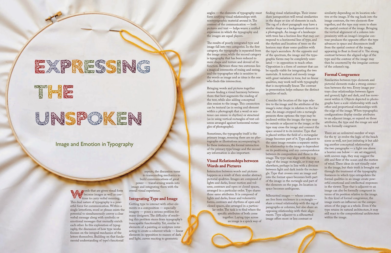
I decided to have some fun with the colour choices in the layout, particularly with the title.  I ended up going with two cool colours (green and blue), two warm colours (red and yellow) and one colour (purple) that is somewhere in between a cool and warm colour.  In the photograph, I decided to go with the yellow for the thread running through the needle because I felt that yellow is a bright colour but not too bright as to distract the viewer’s eye from what was important.  Instead I wanted to use the yellow thread to guide the viewer into the second page of the layout.

The rest of the composition is composed of a neutral colour as to not take away from the colours used in the title but, rather, to support them.  Furthermore, I went with neutral colours because I felt they work best with the handmade letters and the body of the design.

Grid
I wanted to work around the strong shapes in the photograph in order to blur the boundary between image and text. As a result, I went with a three-column grid. I felt that line length in this grid enough to give me some flexibility to play with in managing the the shape of the text in relationship to the image. This is particularly true on the first page of the spread where I wanted to have the image shine but to not lose the ability to have a sufficient amount of text to not have it look awkward. 

Image and Text
The overall concept for my design was to have the line between type and image blurred. It was very important to have the image and the text work together and to compliment each other. With that being said, the title of the spread is quite bold and does stand strong, particularly with the use of colour and texture created by the handmade letters juxtaposed against the neural background.

In regards to the title, I felt the line between text and image was more successful here.  I hand sewed the letters and when I placed them into the spread on top of the material in the embroidery hoop the viewer is unable to figure out if the letters are embroidered into the material in the hoop or not. Visual element, such as the holes created by the stitches, increases the inability of the viewer to determine if the handmade letters are part of the photograph or not. As a direct result, this juxtaposition becomes part of the image and engaging part of the design.  


Furthermore, with the use of the needle and thread, the eye is directed towards the main article, further enhancing the continuity of image working with text. For the image itself, I wanted to keep it neutral in order to not overpower the craftsmanship of the handmade letters and the yarn that was used throughout the layout. 

Wednesday 12 March 2014

Texture Photography

I was recently given a project to explore the topic of texture.  At first I can tell you that this threw me for a loop.  Don't get me wrong I completely understand the idea of texture and that everything around us has texture. But that is the issue.  Everything has texture so how do you make something look interesting enough and show enough texture that you want to reach into a photograph and just touch it. Well in the end this is what I created.


I used two lights in order to simulate daylight.  I had a direct light which was shining on the "puff ball" (I honestly forget the name of this plant but you can find them near water) from the left. Then I had a reflective light where I used a photography umbrella.  The light was directed away from the plant but because of the umbrella reflecting light I had a nice defused light shinning on the plant.  Anyways, I am quite happy with this!


I did pretty much the same thing here. The only difference is I had more room to play around with so the lights where further apart resulting in more contrast between the areas where the light hit he yarn and the shadows. I really love the colours and the feel of the wool.